Synergy
This is some text inside of a div block.
This is some text inside of a div block.
Implemented user research and testing to create a visually appealing and highly functional interface that increased user engagement and sales.


Redesigning the navigation resulted in scores 2x usability benchmark scores than before. Additionally, it increased vertical time spent and click through ratings
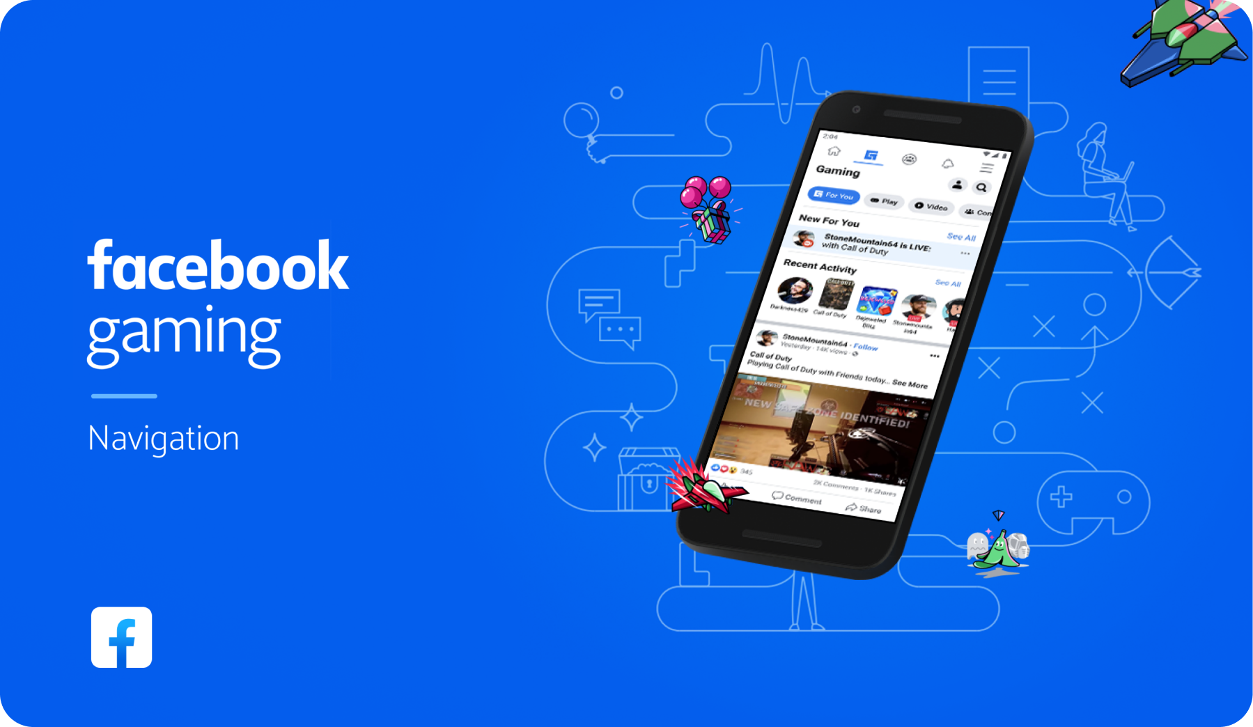
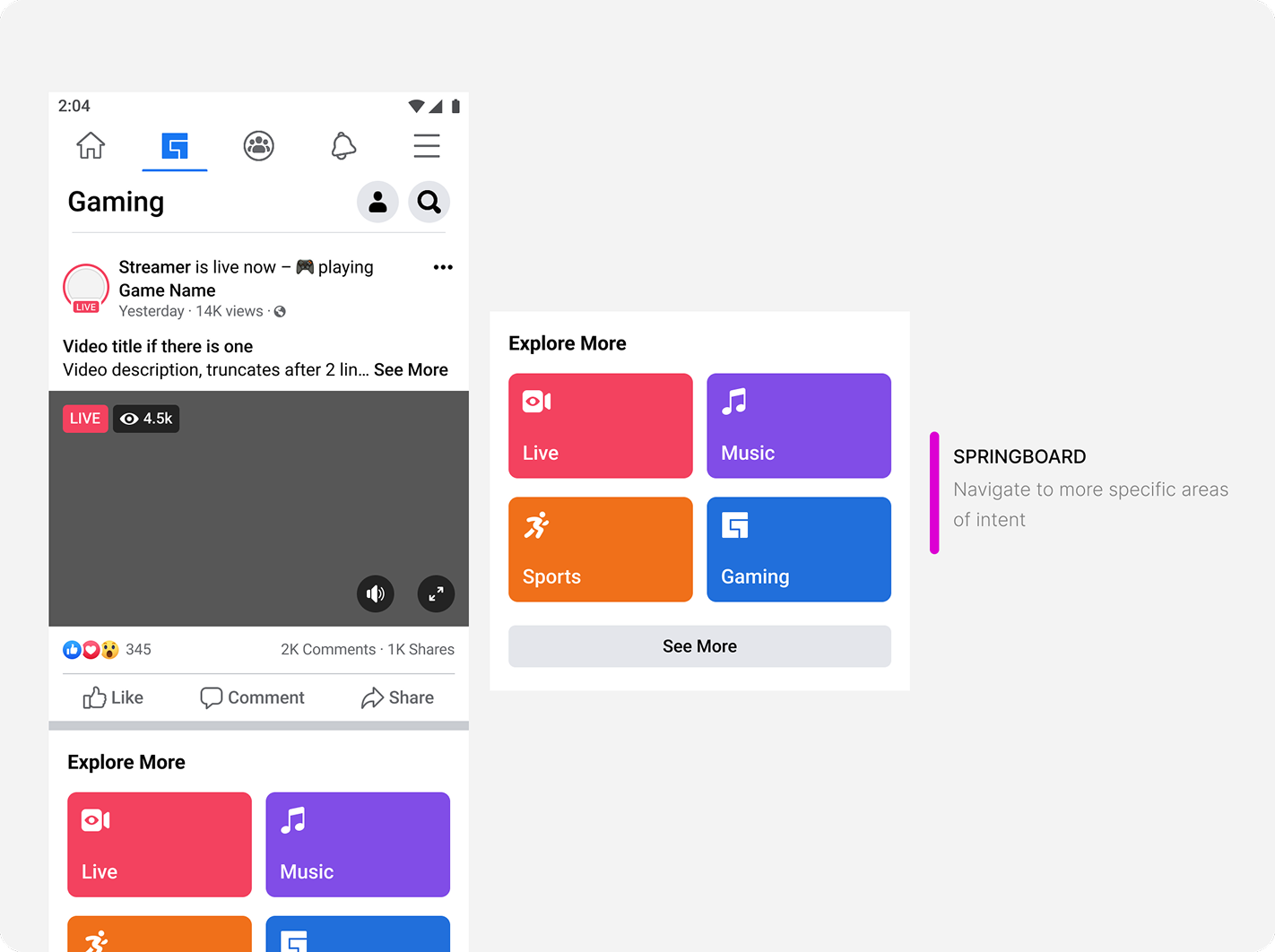
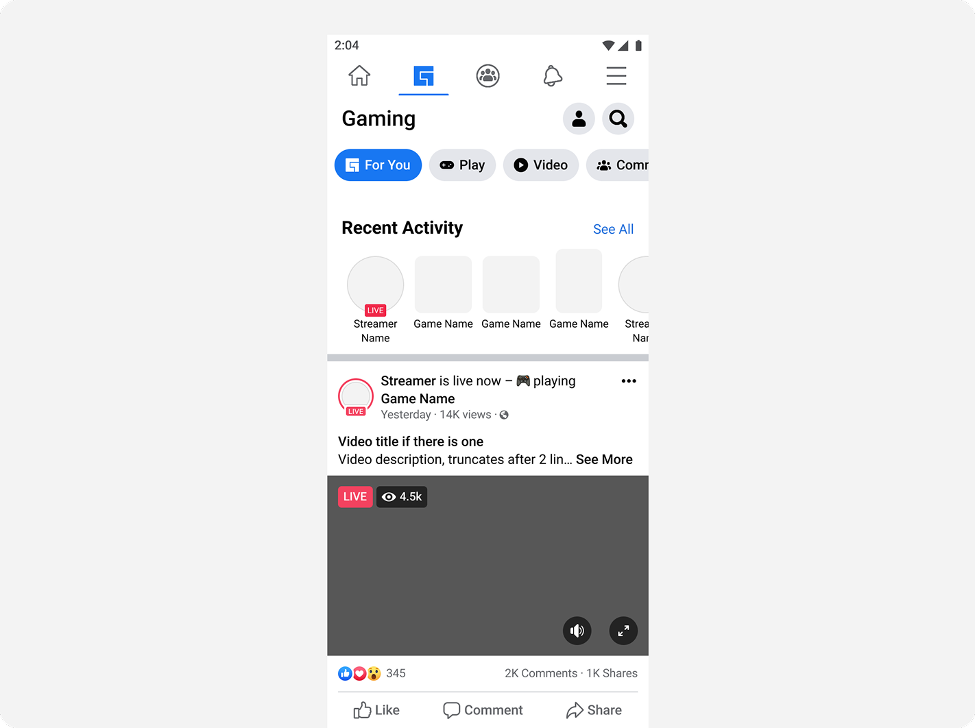
Gaming tab lives within the Facebook app. Within the tab itself are a number of content areas which users can explore. Our problem starts with the data point that our users are not utilizing the navigation.
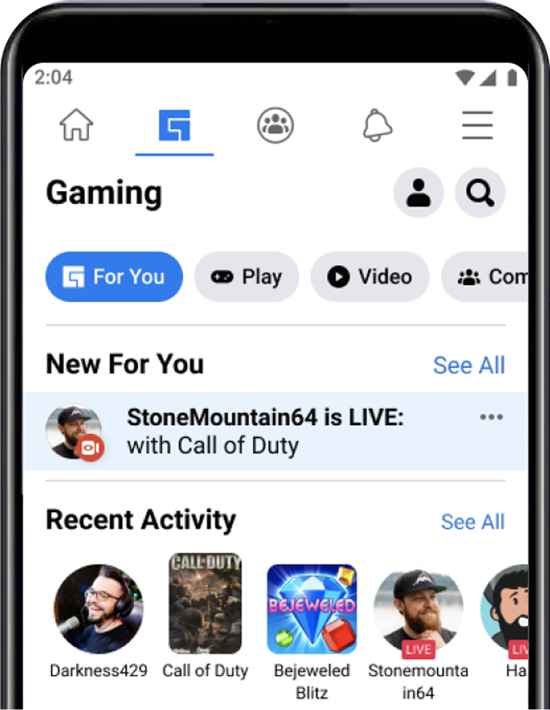
Our problem starts with the data point that our users are not utilizing the navigation.
To develop a navigation in which users can answer: “what can I do here?” and “what is this space for?”
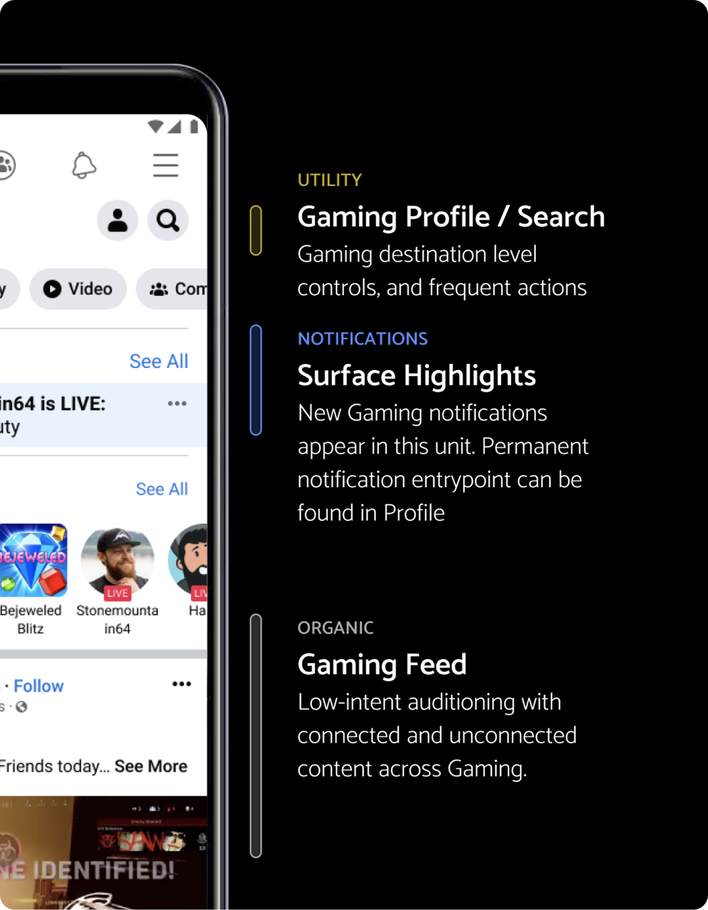
Navigation and discovery:
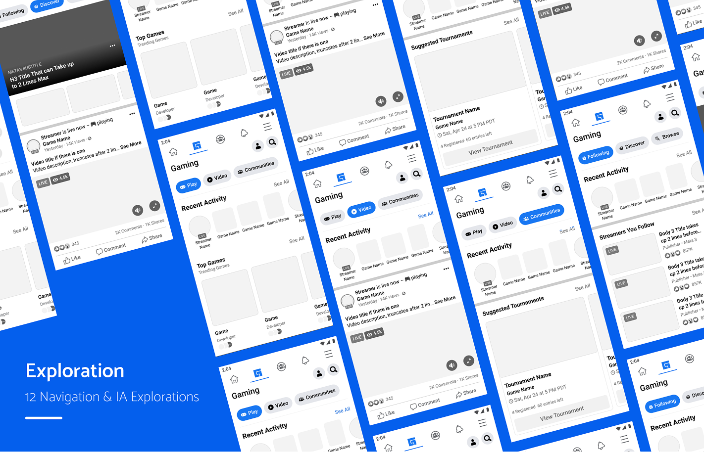
The navigation redesign took 3 phases of development: design exploration, engineering experimentation, and user research
.png)
Navigation and IA resulted in higher click-through-rating, and increased traffic to subsurfaces
Personal
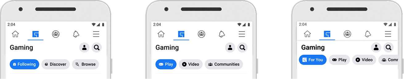
Following / Discover / Browse
Action
Play / Video / Communities
Hybrid
For you / Play / Video / Communities
There are 4 types of navigational components within the Facebook Design system. We started here to determine if these could fit our needs:
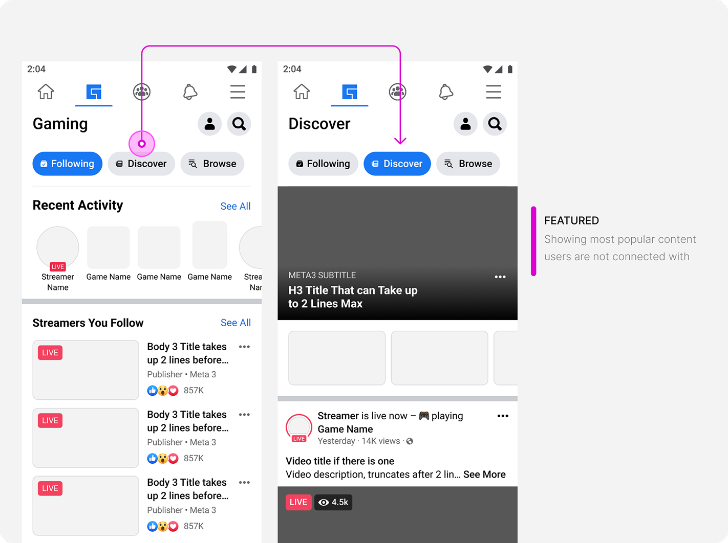
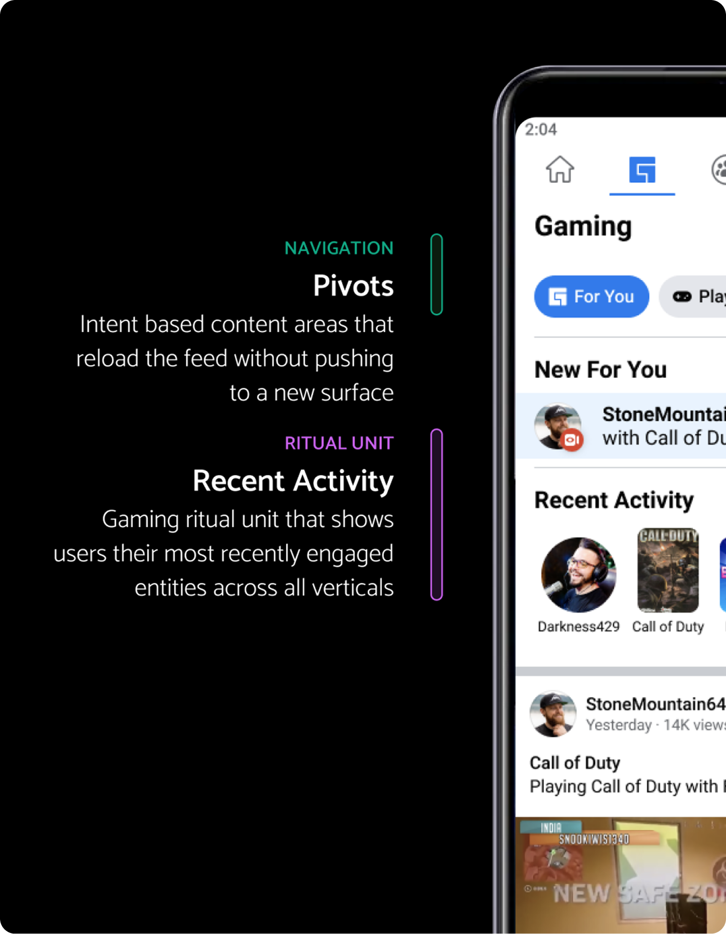
Navigates to new page or surface
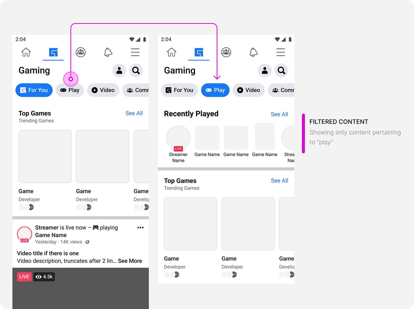
Takes current content and filters down to selected content
Reloads the content below the navigation to show selected content

Content is primarily passive scrolling and more heavily reliant on machine learning for targeting and springboards. The flat feed does not consider users who do not want to passively scroll, but come to gaming with an intent. This type of navigation is not a consistent experience.
Grounding decisions on principles
Hybrid & pivots was the only solution that respected the principles and goals set for navigation
Based on these behaviors, the project successfully allowed users to answer: What can I do here and what is this space for?


.svg)